Penelope's Weavings and Unpickings

Archive for the ‘art’ Category

Baron Alexander

Posted by weavingsandunpickings on March 11, 2022

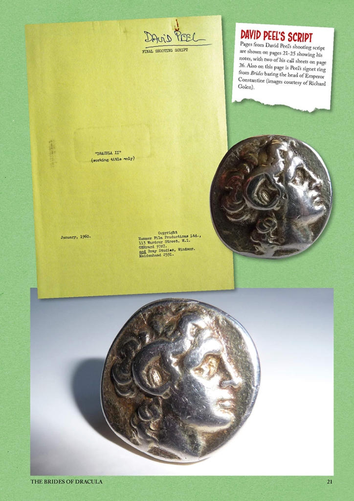
This week I ordered a copy of The Hammer Vampire Scrapbook by Wayne Kinsey. It hasn’t arrived yet, but I’m already fascinated by this page (one of a dozen made available as previews on the Peveril Publishing website, and which I hope they therefore won’t mind me replicating):

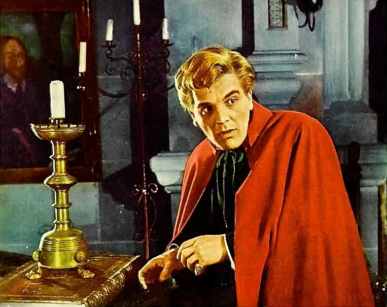
It shows the signet ring David Peel wore as the Baron Meinster in The Brides of Dracula (1960): something I’d never previously noticed when watching the film. Checking back, I could see why. It isn’t very prominent. However, Peel certainly is wearing a signet ring in the film, and after revisiting it and some of its publicity materials, I’m pretty convinced it is indeed the one shown in Kinsey’s book.

The signet part of the ring seems to be an ancient coin. Although the pictures in Kinsey’s book don’t show the back, presumably at some point the ancient coin was welded onto a modern ring so that it could be worn, and in the bottom of the two images it seems to be standing propped up on that ring.

But the image on the ring isn’t the Emperor Constantine, as Kinsey has it. It is most definitely Alexander the Great. If you need convincing on that point, here’s a page of the coinage of Constantine, and here’s an equivalent for Alexander the Great. They lived 600 years apart, and it’s not just that their portraiture is different: their coinage is technically and stylistically extremely different too.

I’m not saying this purely to be pedantic. I’m saying it because I think knowing that David Peel wore an Alexander the Great signet ring to play the Baron Meinster adds at least two, possibly three, extra little windows of insight into Brides of Dracula as a film.

1. The Queer

Recently, I took part in a livestreamed webcast with notorious Hammer-enablers and all round lovely fellows Hammer Gothic and exclusivephd. We talked our way through the first three of Hammer’s vampire films, including Brides, and very much agreed that all three are absolutely dripping with queer subtext. There is a long-standing tradition in both literature and film of vampires being coded as both queer and gender-transgressive anyway, while a large part of Hammer’s approach to vampirism was to treat it more or less directly as a metaphor for sex, inviting those themes ever closer to the surface.

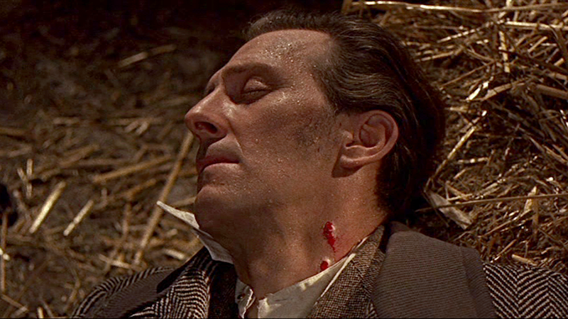
In Brides specifically, the queer coding around the Baron Meinster includes the way his mother keeps him out of the public eye and talks about how she is ashamed of his lifestyle, and the final confrontation between him and Van Helsing, in which the Baron swings a chain at his opponent, chokes him and then bites him. After the bite, we get a close-up view of the Baron’s face with Van Helsing’s blood dripping down his chin, followed by a cut to Van Helsing, his face beaded with sweat, his clothes askew, and the open wound on his neck oozing with those same bodily fluids. I am just telling you what’s there on the screen.

It’s possible that some of this came to the fore within the narrative because David Peel, who played the Baron, was gay: at least as far as we can reliably say for someone who died in 1981 and couldn’t have been publicly out in 1960. Certainly, although there are ways in which Christopher Lee’s Dracula is also queer-coded and gender-transgressive, we never see his character biting another man on screen. Perhaps Peel was willing to play up those angles in ways that Lee wasn’t, or other members of the production team found them easier to imagine?

Back to the Alexander the Great signet ring. Alexander’s sexuality is even harder to pin down in modern terms than Peel’s. He lived in a time when there was no real concept of a person’s sexual identity, and the sources for him are highly mythologising anyway. But he is widely regarded as a queer icon. Here’s just one rather good blog post on the topic.

In that light, knowing that in Brides the Baron Meinster wears an Alexander the Great signet ring definitely adds to his queer coding. In fact, I wonder if that little touch came from Peel himself. Wikipedia tells me that when he moved out of acting only a few months after completing Brides of Dracula, one of the alternative careers he pursued was in antiques dealing. If he had that interest and those contacts already when making Brides, it might explain why he had such a ring or understood its historical resonances. Perhaps in fact it was simply a ring he wore regularly himself as a veiled way of expressing his sexuality? I’d love to know.

2. The Pagan

Another aspect of Brides of Dracula which I’ve always loved is the way it casts vampirism specifically as a pagan cult. At one point, Van Helsing explains to the local priest, Father Stepnik, that vampirism is ‘a survival of one of the ancient pagan religions in their struggle against Christianity’. This doesn’t come out of nowhere. Stoker’s novel contains references to pagan deities such as Morpheus and Demeter, and at one point when things are going badly with Lucy, Van Helsing exclaims: ‘Is there fate amongst us still, sent down from the pagan world of old, that such things must be, and in such way?’ The zodiac wheel on the library floor in Dracula (1958) is also inscribed with some distinctly pagan texts. But Brides states it outright as an explicit part of the equation.

Again, Alexander the Great adds to this. He lived in a pagan world, but more than that the specific image of him shown on the Baron’s signet ring reflects the ways in which he used religion to enhance his position as a ruler. It shows him in a divine guise, his head adorned with the horns of Zeus Ammon, whose priests hailed Alexander as his son when he visited Ammon’s sanctuary in Egypt. Alexander seems to have encouraged this belief in life, but the coin used for the Baron’s signet ring in Brides is actually a type widely minted by Lysimachos, who became king of Thrace after Alexander’s death. Here’s a typical example. By the time Lysimachos was minting those coins, Alexander was being treated posthumously as the object of religious cult in his own right, so the coin shows a chain of divine descent: Lysimachos’ patron deity, Alexander, with horns indicating his own connection to Zeus Ammon.

Going back to Brides, there are all sorts of things we can do with this. Was the pagan religion Van Helsing referred to the cult of Zeus Ammon? Or perhaps of Alexander himself? Perhaps the Baron is like Lysimachos: an aristocratic ruler drawing his power partly from association with the patron deity whose image he bears on his signet ring? Again, not to be pedantic, these possibilities aren’t available for consideration if we think the signet ring bears the image of Constantine. Indeed, it would make absolutely zero sense for a vampire in the Hammer-verse to be wearing the image of a Christian emperor.

3. The Hair?

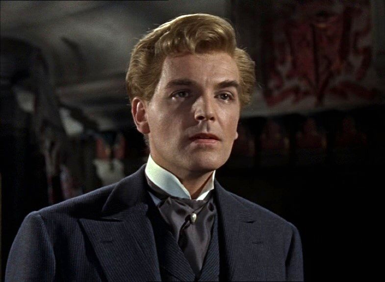
The third aspect I’m not so sure about, but I’ll put the idea out there anyway. In Brides of Dracula, David Peel sports not his own natural dark hair, which can be seen here, but a blond costume wig with a sort of curled quiff at the front. In keeping with a trope already established in Dracula (1958), we see this in two guises: neatly ordered when he is engaged in passing as human for nefarious purposes, and tousled when his bestial vampiric nature comes to the fore.

Peel’s hair in this film is normally discussed in terms of appealing to the teen market by presenting him as youthful and charming, but as it happens, Alexander the Great was also blond, and his portraiture showed him with tousled hair and curls breaking over his forehead.

We don’t need to believe that anyone in the Hammer make-up and wardrobe department was familiar with the ancient portraiture of Alexander the Great to draw a link between the two, because there had been a recent intermediary. Richard Burton’s title character in Alexander the Great (1956) also sports curly, tousled hair in a very similar strawberry-blond shade to the Baron Meinster’s.

The styling isn’t quite the same, of course, which is why I’m not sure I really want to commit to this one. But it’s just possible that the Baron Meinster’s curly fringe and tousled vampire-mode hair were designed as another way of evoking Alexander the Great: specifically as portrayed in the 1956 film.

I’d love to be able to close the loop at this point by saying that such a connection also feeds back into the Baron’s queer-coding, but there things definitely fall apart because Richard Burton’s Alexander is thoroughly straightwashed. But it doesn’t really matter. We have an image of the real Alexander on the signet ring right there in the film, and that’s enough for me.

Posted in art, classical receptions, films, greek history, horror, sexuality | Leave a Comment »

Recycled Piranesis and an impossible Pantheon: The Grand Tour paintings from the Ebony Bedroom at Charlecote Park in Warwickshire

Posted by weavingsandunpickings on October 25, 2012

In late August my sister and I took our mother for a birthday day out, which included an afternoon visit to Charlecote Park National Trust property in Warwickshire. Charlecote is a lovely 16th-century red brick property, set on an estate which has been home to the Lucy family from the 12th century right up to the present day, and we very much enjoyed exploring its grounds in beautiful sunny weather. Late in the afternoon, my mother and I looked round the rooms of the property itself, and ended our visit in the Ebony bedroom – so called after the grand ebony-wood bed which dominates the room.

What really caught my eye, though, was not the bed but the set of paintings on the walls, brought back to Charlecote Park by George Lucy (master of the house from 1744 to 1786) after a Grand Tour undertaken in the late 1750s. There are fourteen of them in total (although the volunteer guide in the room told us that there had once been twenty), depicting romantic scenes of semi-ruined monuments from ancient Rome. But as we chatted about them to the guide, he mentioned that no-one who worked at the property today knew exactly what the monuments depicted were. Well, I did. I could see straight away what several of them were, and knew it wouldn’t take me long with access to the right books to identify the others. And it seemed such a pity for the subjects of the pictures to go on being unidentified when I could so easily sort that out. So after I had returned to Leeds at the end of the weekend, I wrote to the House Steward offering to identify the monuments shown if she could send me some pictures of them to work from. She kindly obliged, and I got to work.

At first, I simply focused on identifying the monuments shown in the paintings. Most I recognised immediately, while others could be tracked down fairly easily, just as I had suspected. Of the fourteen pictures in the house, half showed scenes from Rome itself, including well-known monuments such as the remains of the Forum, the Pyramid of Caius Cestius, the round temple in the Forum Boarium and the Pantheon. Three more showed tombs and aqueduct arches along the roads leading out from Rome into the Campagna; a further three ventured to Tivoli (twenty-five miles east of Rome) for the so-called ‘Tempio della Tosse‘ and two views of the Anio falls; and one final picture showed the supposed tomb of Virgil just outside Naples.

But I quickly realised as I jotted down the names of the monuments that some of the scenes looked awfully familiar. Following a hunch, I tracked down some engravings of the same monuments by Piranesi, and sure enough, I found that at least five of the Charlecote paintings had clearly been modelled directly on his work. A good example is the image of the so-called ‘Tempio della Salute’ (Temple of Health) near to the Via Appia, about 3 miles south-east of Rome – today recognised not as a temple at all, but as a second-century monumental brick-built tomb. Below is the Charlecote Park image and the Piranesi equivalent:

Image reproduced with permission. Photograph by Claire Reeves.

Image taken from Wikicommons.

It’s not just that these two images are very similar in their composition, surrounding scenery and figures – including the goats! The real give-away to their relationship lies in the two distinctive triangular shadows shown on the side of the monument in each. These could not have been cast by any real structure, since nothing appropriate stands nearby. Rather, they were probably added by Piranesi to his engraving to evoke monuments from other parts of Rome like the Pyramid of Caius Cestius, and create the sense of a wider landscape of ruins around this structure. (This is very typical of the way Piranesi worked – his views of ruined monuments were often romanticised, presenting the monument itself with the accurate eye of an architect, but freely embellishing the context.) The presence of the exact same shadows on the Charlecote Park painting is enough to show that its artist must have used Piranesi’s engraving as a model, creatively recycling it (shall we say?) as the basis for a gouache colour painting.

Piranesi was not the only influence I could detect behind these paintings. The Charlecote painting of the tomb of Virgil, for example, likewise shares the same composition and figures as this image, also from the 18th century. But it’s no great surprise to find that Piranesi’s engravings were the single greatest source of inspiration for the Charlecote artist. George Lucy’s visit to Italy would have taken place right at the height of Piranesi’s career and just when his engravings were first taking Rome by storm. His drawings attracted great admiration in their own right, and helped to drive an already growing interest in Rome’s monuments to even greater heights. So of course contemporary Roman artists were busy replicating them (and others like them) for English gentlemen like George Lucy to buy and take home as a souvenirs. The blatant copying by direct contemporaries seems rather shocking to us, but this was a world which lacked even the concept of copyright. And perhaps having colour paintings of Piranesi’s images instead of the rather severe black and white originals even seemed like the superior option, rather than the cheap knock-off alternative?

Meanwhile, one painting must be based on an image by an artist considerably earlier than Piranesi. That is the Charlecote Park image of the Pantheon, which looks like this:

Image reproduced with permission. Photograph by Claire Reeves.

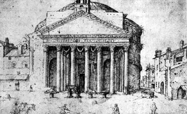
The Pantheon can never have looked quite as it is shown in this painting, as some fine-detail architectural history (gleaned in particular from this excellent article by Tod A. Marder) and other contemporary images reveal. Firstly, during the medieval period, the left-hand end of the Pantheon’s front portico was engulfed in adjoining buildings, and a single central bell-tower was built on top of the pediment. A drawing by Van Heemskerck dated 1532-36 shows it in this state:

Image from here.

Between 1626 and 1633, pope Urban VIII had the central bell-tower removed, and two new ones, popularly known as le orecchie d’asino (the asses’ ears), built onto either side of the pediment. He also had the front left corner of the portico repaired, but otherwise left the medieval buildings butting up against it at the side in place. A drawing by Stefano della Bella dated 1656 shows the results of his work:

Image from here.

The medieval buildings were then finally demolished in 1662 on the orders of pope Alexander VII. He also had the portico fully repaired in 1666-7, and two columns still missing from the side replaced using ancient columns found near S. Luigi dei Francesci, probably originally from the baths of Nero. But the asses’ ears remained in place, and were not removed until 1883. Piranesi’s engraving of the Pantheon from a century later, in 1761, captures very nicely what it looked like after Alexander VII’s intervention:

Image from here.

Meanwhile, the Charlecote Park version of the Pantheon shows it without either the adjoining medieval buildings or the asses’ ears. But this is impossible, since the asses’ ears were added before the medieval buildings were removed. In fact, the Charlecote painting seems to show a yawning gap where those buildings had been, before the repairs at this end of the portico were completed on the orders of Alexander VII. This makes me suspect that this image of the Pantheon was originally created while that work was underway in the 1660s, but that the artist deliberately chose to omit the asses’ ears. Not a very surprising choice, given how much everyone seems to have hated them!

Presumably, that original image was then reworked around a century later to create the Charlecote painting, which clearly fits in right alongside the rest of the set in stylistic terms. I can’t track down an exact original model for this particular image, but it would have been very odd indeed for somebody painting the Pantheon in the 1750s or ’60s to think to show the left-hand end of its portico in a semi-ruined state, give that it hadn’t looked like that for almost a century by then. You have to wonder, though, how the decision to depict the Pantheon in this way, rather than as it actually looked in the 1750s, came about. Did the artist choose to depict the Pantheon stripped of later additions or repairs, because he (or she) had found that customers generally preferred Roman ruins which looked as though they had simply crumbled away gently for centuries, untouched by human hands? Or was it simply an accident arising from whatever original image he or she was working from? Similarly, did George Lucy actively choose a painting which showed the monument in this light – or, conversely, did he even notice that it didn’t look quite like the Pantheon as he had actually seen it?

There are all sorts of further questions I’d like to answer about these paintings, for that matter. Another one would be how closely the geographical settings of the paintings match up with the places which Lucy actually visited while he was in Italy. Did he, for example, go down to Naples and see the supposed tomb of Virgil for himself? I’m also interested to note that Lucy’s visit to Italy seems to have taken place in the late 1750s, but (as far as I’m aware at the moment) Piranesi’s engravings of the Porta Tiburtina and the Nymphaeum of Alexander Severus first came out in 1761. These were clearly the sources for two of the Charlecote paintings, which that ought to mean the latter couldn’t have been painted until 1761 or later. But I’d need to do some library work to double-check that this really was the original publication date for the Piranesi engravings, and not just the date of a reissue. If correct, though, it might mean that George Lucy bought the paintings via agents after he himself had returned home – so perhaps he never even knew about the Piranesi images which they had been modelled on.

Recycled or not, though, this is a fantastic set of paintings which say a lot about the tastes and sensibilities of 18th century Grand Tourists – and the people who catered for them! I’m very glad to have come across them on a summer’s afternoon, and I hope I will have the chance to delve deeper into their history very soon.

Posted in art, classical receptions, history, rome | 7 Comments »